Charting Skills for Business Leaders
> Audience: Business Executives · Project Managers · Entrepreneurs > Purpose: Master the 16 most impactful charts to communicate strategy, track performance, and drive decisions.
---
Why Charts Matter in Business
Charts are the language of leadership. A well-chosen chart can:
- Compress weeks of analysis into a 10-second insight
- Build stakeholder alignment without lengthy explanations
- Surface patterns invisible in raw data tables
- Make complex decisions auditable and defensible
The charts below are ranked by strategic breadth — how many business scenarios each type serves across planning, execution, and communication.
---
Default Plotting Contract
When asked to plot, generate, or design a chart, create a slide-ready diagram by default:
- Canvas: use a 16:9 draw.io page, preferably
1600x900(pageWidth="1600"andpageHeight="900"). Keep content inside a safe area of about70,70,1460,800. - Primary output: include a
## draw.io XMLsection with paste-ready XML for draw.io / diagrams.net. Do not only describe the diagram. - Style: use executive presentation styling: white background, thin light-grey borders, dark text, restrained pastel section fills, and one accent color for active/important process elements.
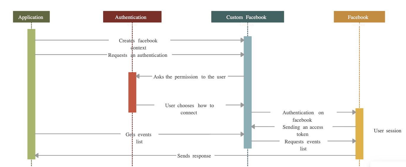
- UML flows: when the content is a process, system interaction, knowledge workflow, actor-to-system exchange, API sequence, or handoff between roles/tools, prefer a UML sequence-flow diagram over a generic flowchart.
- Sequence-flow visual language: use participant header boxes across the top with 24pt bold entity names, warm dashed vertical lifelines, teal activation bars, solid arrows for calls/writes, dashed arrows for returns/confirmations, and pastel loop/phase bands on the left.
- Readability: number messages in order, keep labels short, align related messages on shared rows, and leave enough horizontal spacing for long arrows.
- Branding: if the user provides a brand, place a small logo/text mark in the upper-left corner without letting it dominate the diagram.
For the house UML sequence-flow style, use charting-skill-sequential-flow.drawio as the canonical editable style reference, sequential-diagram-example.png as the screenshot reference, and uml_sequence_flow.md as the paste-ready XML example.
---
The Top 16 Charts
| # | Chart | Primary Power | Best For | |---|-------|--------------|---------| | 1 | Gantt Chart | Timeline visibility | Project managers, PMO | | 2 | Waterfall Chart | Change decomposition | CFOs, financial analysts | | 3 | Balanced Scorecard Map | Strategy alignment | CEOs, strategy leads | | 4 | BCG Growth-Share Matrix | Portfolio prioritization | Entrepreneurs, VCs | | 5 | Fishbone / Ishikawa Diagram | Root cause analysis | Ops managers, QA leads | | 6 | SWOT Diagram | Situation analysis | All business leaders | | 7 | Funnel Chart | Conversion tracking | Sales, marketing, growth | | 8 | Burndown Chart | Sprint/project health | Agile PMs, tech leads | | 9 | Stakeholder Map | Influence & alignment | Change managers, PMs | | 10 | Value Stream Map | Waste elimination | Lean/operations leaders | | 11 | Heat Map | Priority density | Risk officers, strategists | | 12 | Business Model Canvas | Venture architecture | Entrepreneurs, founders | | 13 | RACI Chart | Accountability clarity | Project managers, HR | | 14 | OKR Tree / Goal Cascade | Objective alignment | CEO, department heads | | 15 | Decision Tree | Scenario planning | All strategic leaders | | 16 | UML Sequence Flow | Interaction clarity | Architects, PMs, ops leads |
---
1. Gantt Chart
What it is: A horizontal bar chart showing tasks across a timeline with dependencies.
When to Use
- Kicking off a project: map milestones, tasks, and owners across weeks/months
- Mid-project check-ins: visualize slippage and reschedule dependencies
- Stakeholder reporting: give executives a one-page project timeline view
- Resource planning: spot overloads by seeing who owns what, when
Scenarios
| Scenario | How to Apply | |----------|-------------| | Product launch | Map all launch tracks (marketing, dev, legal, ops) in one view | | ERP implementation | Show phase gates: design → build → UAT → go-live | | Quarterly planning | Break OKRs into deliverables with dates | | Vendor management | Track external dependencies alongside internal tasks |
Key Elements
- Task bars on a time axis
- Milestones (diamonds) for critical deadlines
- Dependencies (arrows) between tasks
- Percent complete shading for progress
Common Pitfalls
- Too granular (100+ tasks) → use summary-level Gantt for leaders
- No buffer time between dependent tasks
- Not updating weekly → stale charts erode trust
→ Example: gantt_chart.md
---
2. Waterfall Chart
What it is: A bridge chart showing how individual positive/negative values cumulatively add up to a total.
When to Use
- Monthly/quarterly P&L reviews: show revenue → COGS → gross profit → EBITDA
- Budget variance analysis: starting budget → actual spend → ending balance
- Headcount planning: starting HC → hires → attrition → ending HC
- Project cost walk: baseline → change orders → final cost
Scenarios
| Scenario | How to Apply | |----------|-------------| | Board financial review | Walk from revenue to net income, showing each cost bucket | | Sales performance | Starting pipeline → new leads → closed → lost → ending pipeline | | Startup runway | Cash balance walk: funding → burn → milestones → runway end | | Market share | Start share → gained from competitors → lost → end share |
Key Elements
- Floating bars for intermediate values (neither starting from zero)
- Color coding: green = increases, red = decreases, grey = totals
- Connector lines between bars for readability
Common Pitfalls
- Mixing categories (cost types with revenue) confuses the narrative
- Not labeling the delta on each bar
- Using standard bar chart instead of true waterfall → loses the "bridge" story
→ Example: waterfall_chart.md
---
3. Balanced Scorecard Map
What it is: A strategic framework linking objectives across four perspectives: Financial, Customer, Internal Processes, and Learning & Growth.
When to Use
- Annual strategy setting: translate vision into measurable objectives
- Executive alignment: ensure all departments pull toward the same goals
- KPI cascading: link high-level strategy to team-level metrics
- Board reporting: show strategy execution health holistically
Scenarios
| Scenario | How to Apply | |----------|-------------| | Corporate strategy review | Show 3–5 objectives per quadrant with owners and target KPIs | | Department alignment | Map each team's OKRs to the corporate scorecard | | Investor presentation | Demonstrate you manage the business beyond just financials | | Turnaround plan | Identify which quadrant is the root constraint (e.g., internal processes) |
Key Elements
- Four quadrants: Financial → Customer → Internal Process → Learning & Growth
- Cause-effect arrows linking objectives across perspectives
- KPI, target, and owner per objective node
Common Pitfalls
- Too many objectives (>5 per quadrant) dilutes focus
- Missing cause-effect linkages → becomes a KPI list, not a strategy map
- Not reviewing quarterly → becomes a wall decoration
→ Example: balanced_scorecard.md
---
4. BCG Growth-Share Matrix
What it is: A 2×2 matrix plotting business units or products by market growth rate (Y) vs. relative market share (X).
When to Use
- Portfolio review: decide where to invest, harvest, or divest
- Product strategy: categorize products as Stars, Cash Cows, Question Marks, or Dogs
- Resource allocation: direct R&D and capex to the right bets
- M&A target screening: identify acquisition targets that complement your portfolio
Scenarios
| Scenario | How to Apply | |----------|-------------| | Multi-product company | Plot all product lines; allocate budget toward Stars | | Startup portfolio | VC mapping investments: which need more runway vs. which to double down | | Annual strategy offsite | Facilitate leadership debate on which "Question Marks" to accelerate | | Competitive analysis | Plot competitors' products to find market gaps |
Quadrant Guide
| Quadrant | Label | Action | |----------|-------|--------| | High growth, High share | ⭐ Star | Invest aggressively | | Low growth, High share | 🐄 Cash Cow | Harvest & fund Stars | | High growth, Low share | ❓ Question Mark | Decide: invest or kill | | Low growth, Low share | 🐕 Dog | Divest or maintain minimally |
Common Pitfalls
- Using revenue share instead of relative market share
- Ignoring synergies between units
- Treating it as static — run it annually
→ Example: bcg_matrix.md
---
5. Fishbone / Ishikawa Diagram
What it is: A cause-and-effect diagram shaped like a fish skeleton, grouping root causes by category.
When to Use
- Post-mortem / incident review: find why a project failed or a bug escaped
- Quality improvement: analyze defects in a product or process
- Strategic problem framing: understand why a KPI is underperforming
- Pre-mortem: anticipate failure modes before a launch
Scenarios
| Scenario | How to Apply | |----------|-------------| | Customer churn spike | Categories: Product, Support, Pricing, Onboarding, Competition | | Failed product launch | Categories: Marketing, Sales readiness, Tech, Operations, Timing | | Manufacturing defect | Classic 6M: Man, Machine, Method, Material, Measurement, Mother Nature | | Revenue miss | Categories: Pipeline, Win rate, Pricing, Retention, Expansion |
Key Elements
- Head (effect): the problem statement
- Spine: main horizontal arrow
- Bones: category branches (usually 4–8)
- Sub-bones: specific contributing causes
Common Pitfalls
- Stopping at symptoms, not root causes (ask "Why?" 3–5 times per branch)
- Too many bones → use affinity clustering first
- Not validating causes with data
→ Example: fishbone_diagram.md
---
6. SWOT Diagram
What it is: A 2×2 matrix capturing internal Strengths & Weaknesses vs. external Opportunities & Threats.
When to Use
- Strategic planning sessions: baseline situational awareness
- New market entry: assess readiness vs. market conditions
- Competitive response: evaluate your position before a competitor move
- Investor pitches: demonstrate self-awareness and strategic clarity
Scenarios
| Scenario | How to Apply | |----------|-------------| | Annual strategy offsite | Ground the team before setting objectives | | New product launch | Is the timing right given market threats? | | Partnership evaluation | Do partner strengths offset your weaknesses? | | Pivot decision | Are external opportunities strong enough to overcome internal weaknesses? |
Extension: TOWS Analysis
Convert SWOT into action by crossing quadrants:
- S + O → Maxi-Maxi: leverage strengths to capture opportunities
- W + O → Mini-Maxi: fix weaknesses to access opportunities
- S + T → Maxi-Mini: use strengths to neutralize threats
- W + T → Mini-Mini: reduce weaknesses to avoid threats
Common Pitfalls
- Generic statements ("good team", "competition") — be specific
- No prioritization within each quadrant
- Not translating to action (TOWS extension solves this)
→ Example: swot_diagram.md
---
7. Funnel Chart
What it is: A tapering shape showing volume at each stage of a sequential process.
When to Use
- Sales pipeline management: Leads → MQL → SQL → Proposal → Close
- Marketing conversion: Impressions → Clicks → Sign-ups → Activation → Retention
- Hiring funnel: Applicants → Screened → Interview → Offer → Accepted
- User onboarding: Registered → Profile complete → First action → Power user
Scenarios
| Scenario | How to Apply | |----------|-------------| | Sales QBR | Show where deals are leaking; focus coaching on biggest drop-off | | Growth review | Compare funnel week-over-week to detect conversion regressions | | Product analytics | Where do users drop off in the onboarding flow? | | Investor reporting | Demonstrate CAC efficiency and conversion benchmarks |
Key Metrics to Show
- Volume at each stage
- Conversion rate between stages (the critical insight)
- Benchmark vs. prior period or industry standard
Common Pitfalls
- Not showing conversion % between stages — the bar heights alone are misleading
- Too many stages (>7) — consolidate
- Mixing B2B and B2C funnels with different definitions
→ Example: funnel_chart.md
---
8. Burndown Chart
What it is: A line chart tracking remaining work (Y-axis) against time (X-axis), compared to an ideal burndown line.
When to Use
- Agile sprints: daily tracking of story points remaining
- Project delivery: track remaining features/tasks vs. a deadline
- Release planning: will we make the ship date at current velocity?
- Budget burn: actual spend vs. planned spend over a project timeline
Scenarios
| Scenario | How to Apply | |----------|-------------| | Sprint planning | Set baseline ideal line; track daily actuals | | Program increment | 8-week PI burndown for SAFe or scaled agile programs | | Product launch countdown | Features remaining vs. launch date | | Cost control | Budget remaining vs. project timeline |
Key Elements
- Ideal line: straight line from total work to zero at deadline
- Actual line: daily/weekly actual remaining work
- Scope change markers: annotate when new work was added
Reading the Chart
- Actual above ideal → behind schedule
- Actual below ideal → ahead of schedule or scope was removed
- Flat actual line → team is blocked or not logging progress
→ Example: burndown_chart.md
---
9. Stakeholder Map
What it is: A 2×2 matrix plotting stakeholders by Power (Y) vs. Interest (X) to drive engagement strategy.
When to Use
- Project initiation: identify who needs to be managed vs. informed
- Change management: plan communications for organizational changes
- Product launches: align internal sponsors and manage resistant stakeholders
- Political navigation: understand the power landscape before critical decisions
Scenarios
| Scenario | How to Apply | |----------|-------------| | ERP rollout | Plot IT, Finance, Operations, Legal, and C-suite — who will block? | | M&A integration | Map acquiree leadership to design the integration comm plan | | Regulatory approval | Identify high-power, low-interest regulators — keep them satisfied | | New product launch | Engage high-interest champions as advocates |
Quadrant Engagement Strategy
| Quadrant | Label | Strategy | |----------|-------|----------| | High power, High interest | Key Players | Manage closely — involve in decisions | | High power, Low interest | Keep Satisfied | Regular status; don't overwhelm | | Low power, High interest | Keep Informed | Newsletters, open forums | | Low power, Low interest | Monitor | Minimal effort; watch for changes |
Common Pitfalls
- Treating the map as static — stakeholder positions shift
- Forgetting informal influencers (low power but high credibility)
- Confusing "interest" with "support" — opposed stakeholders are high-interest too
→ Example: stakeholder_map.md
---
10. Value Stream Map
What it is: A lean process diagram showing every step in a value chain, with time, inventory, and information flows.
When to Use
- Process improvement: identify where time and money are wasted
- Lean transformation: visualize current vs. future state
- Digital transformation: map manual steps that should be automated
- Operations benchmarking: compare your process time to best-in-class
Scenarios
| Scenario | How to Apply | |----------|-------------| | Order-to-cash optimization | Map every step from customer order to cash received | | Software delivery pipeline | Code commit → review → test → deploy → monitor | | Customer onboarding | Application → verification → approval → activation | | Supply chain audit | Supplier → warehouse → production → distribution → customer |
Key Elements
- Process boxes: each step with cycle time and uptime
- Push/pull arrows: show how work flows between steps
- Inventory triangles: queues between steps
- Timeline bar: value-added time vs. total lead time
Key Insight
The gap between value-added time and total lead time is your improvement opportunity. In most processes, value-added time is < 5% of total lead time.
→ Example: value_stream_map.md
---
11. Heat Map
What it is: A grid where cell color intensity represents the magnitude of a value — typically used for risk or priority scoring.
When to Use
- Risk management: plot risks by likelihood × impact
- Product roadmap prioritization: effort × value scoring of features
- Sales territory analysis: performance by region × product line
- Resource utilization: team workload by person × week
Scenarios
| Scenario | How to Apply | |----------|-------------| | Enterprise risk register | 5×5 grid: Likelihood (1–5) × Impact (1–5) → color code risks | | Feature backlog | Value vs. effort matrix; top-right = quick wins | | Customer segmentation | Revenue × growth potential by segment | | Cyber security audit | Threat likelihood × business damage |
Color Conventions
| Color | Meaning | |-------|---------| | 🔴 Red | Critical / Act now | | 🟠 Orange | High / Plan mitigation | | 🟡 Yellow | Medium / Monitor | | 🟢 Green | Low / Accept |
Common Pitfalls
- Subjective scoring without calibration → use a scoring rubric
- Too many items on one heat map → segment into domains
- Not dating the map → stale risk maps are dangerous
→ Example: heat_map.md
---
12. Business Model Canvas
What it is: A one-page strategic template with 9 building blocks describing how a business creates, delivers, and captures value.
When to Use
- Startup ideation: stress-test the business model before building
- Pivot planning: visualize what changes when the model shifts
- Investor pitch preparation: communicate the full business model concisely
- Competitive analysis: map a competitor's model to find gaps to exploit
Scenarios
| Scenario | How to Apply | |----------|-------------| | Pre-seed pitch | Show all 9 blocks; be honest about unknowns | | Established company pivot | Change Value Proposition → trace impact to all other blocks | | Partnership negotiation | Overlay partner's canvas to find complementary blocks | | New market entry | Clone existing canvas, adapt Customer Segments and Channels |
The 9 Blocks
| Block | Question | |-------|---------| | Customer Segments | Who are we creating value for? | | Value Propositions | What problem do we solve? | | Channels | How do we reach customers? | | Customer Relationships | How do we acquire and retain? | | Revenue Streams | How do we make money? | | Key Resources | What assets are essential? | | Key Activities | What must we do well? | | Key Partnerships | Who do we rely on? | | Cost Structure | What are the major costs? |
→ Example: business_model_canvas.md
---
13. RACI Chart
What it is: A responsibility assignment matrix showing who is Responsible, Accountable, Consulted, and Informed for each task.
When to Use
- Project kickoff: eliminate ambiguity about who owns what
- Cross-functional initiatives: clarify roles across departments
- Process documentation: define ownership at each process step
- Conflict resolution: reference the RACI when ownership disputes arise
Scenarios
| Scenario | How to Apply | |----------|-------------| | Software release | Tasks: code, test, approve, deploy, communicate — assign RACI | | Budget approval process | Finance, Business, Legal, CEO — who decides vs. who advises | | Hiring process | Recruiter, Hiring Manager, HR, Panel — clear at each stage | | Incident response | On-call, Manager, PR, Legal, Leadership — who does what |
RACI Definitions
| Letter | Role | Rule | |--------|------|------| | R | Responsible | Does the work. Can be multiple people. | | A | Accountable | Signs off. Must be exactly ONE person. | | C | Consulted | Input required before decision. Two-way comm. | | I | Informed | Notified of outcome. One-way comm. |
Common Pitfalls
- Multiple A → no clear owner, leads to conflict
- No R on a task → it will never get done
- Over-consulting → too many C's slows decisions
- Confusing C and I → consult people who add value, inform the rest
→ Example: raci_chart.md
---
14. OKR Tree / Goal Cascade
What it is: A hierarchical tree diagram showing how company-level Objectives break down into departmental and team-level OKRs.
When to Use
- Quarterly planning: cascade company OKRs to teams
- Annual strategy alignment: ensure every team has line-of-sight to company goals
- Progress reviews: show which branches are on-track vs. at-risk
- New team onboarding: explain how their work connects to company strategy
Scenarios
| Scenario | How to Apply | |----------|-------------| | Q3 planning | CEO sets 3 company OKRs → VP level breaks into dept KRs → teams own tasks | | Remote team alignment | Shared visual shows every team's contribution to company goals | | Board update | Roll up all dept OKRs to company level with RAG (Red/Amber/Green) status | | Investor due diligence | Demonstrate goal-setting discipline and execution tracking |
Tree Structure
Company Objective
├── KR1: [Measurable outcome]
│   ├── Dept Objective A → supports KR1
│   │   └── Team KR: [specific metric]
│   └── Dept Objective B → supports KR1
└── KR2: [Measurable outcome]
    └── Dept Objective C → supports KR2
Common Pitfalls
- Output-based KRs instead of outcome-based ("launch feature" vs. "increase retention 10%")
- Too many OKRs (>3 per level) → dilutes focus
- No mid-quarter review → OKRs become a formality
→ Example: okr_tree.md
---
15. Decision Tree
What it is: A branching flowchart mapping decisions and their possible outcomes, including probabilities and expected values.
When to Use
- Go/No-go decisions: evaluate a product launch, investment, or pivot
- Risk analysis: quantify expected value of different paths
- Policy design: codify decision rules for recurring situations
- Crisis management: pre-plan responses to scenario branches
Scenarios
| Scenario | How to Apply | |----------|-------------| | Market entry decision | Enter now vs. wait; each branch has cost, probability, and payoff | | Pricing strategy | Premium vs. market vs. penetration pricing — model revenue outcomes | | Hiring decision | Internal promotion vs. external hire — map fit, risk, cost | | Fundraising | Bootstrap vs. seed vs. Series A — model runway and dilution |
Key Elements
- Square nodes: decision points (you choose)
- Circle nodes: chance events (probability-weighted)
- Triangle nodes: outcomes (expected value = probability × payoff)
- Pruning: eliminate branches with negative expected value
Expected Value Calculation
EV = Σ (Probability × Outcome)
Example:
  60% chance of $1M success = $600K
  40% chance of $200K failure = $80K
  EV = $600K + $80K = $680K
→ Example: decision_tree.md
---
16. UML Sequence Flow
What it is: A time-ordered interaction diagram showing how actors, systems, tools, or data stores exchange messages across a workflow.
When to Use
- Knowledge extraction, research, or analysis pipelines: User → LLM → raw data → processed data → analysis → output
- Product/system design: user actions, services, APIs, databases, queues, and downstream consumers
- Operational handoffs: requester, reviewer, automation, records, compliance, and reporting
- AI-agent workflows: planner, tool calls, file reads/writes, validation, and final synthesis
Scenarios
| Scenario | How to Apply | |----------|-------------| | Knowledge extraction | Show discovery, scripting, cooking, analysis, synthesis, and visualization loops | | API integration | Show request, service orchestration, database calls, external provider calls, and responses | | AI workflow audit | Show user prompts, model actions, tool reads/writes, validation gates, and returned artifacts | | Process governance | Show phase ownership, approvals, exception checks, and final record creation |
Key Elements
- Participants: header boxes across the top for each actor/system/data store, with 24pt bold entity names
- Lifelines: warm amber vertical dashed lines under each participant
- Activation bars: teal vertical rectangles where a participant is active
- Messages: solid arrows for calls, reads, writes, and commands; dashed arrows for returns and confirmations
- Loop/phase labels: pastel bands on the left describing repeated workflow stages
- Annotations: short notes under important cross-system actions, such as consolidation or conflict checks
Visual Rules
- Use a 16:9 draw.io page (
1600x900) unless the user explicitly asks for another size. - Keep the title centered at the top, with optional small brand mark at upper left.
- Use neutral participant headers (
#F7F7F7,#D9D9D9) with 24pt bold text and warm dashed lifelines (#D6A15E). - Use teal activation bars (
#55C7BE,#2AA79E) to mirror the reference style. - Use soft loop fills: blue discover, yellow script, pink cook/synthesize, green analyze.
- Avoid dense decorative backgrounds; this style should look like a clean PowerPoint-ready architecture/UML slide.
→ Example: uml_sequence_flow.md
Billionary Trader Sequence Examples
- Live account review loop: billionary_trader_live_review_sequence.md
- Backtest engine loop: billionary_trader_backtest_sequence.md
- Playbook evolution loop: billionary_trader_playbook_evolution_sequence.md
---
Quick Reference: Chart Selection Guide
| Business Question | Best Chart | |-------------------|-----------| | "Are we on track?" | Burndown, Gantt | | "Where is the money going?" | Waterfall | | "What caused this problem?" | Fishbone | | "Who does what?" | RACI | | "Where should we invest?" | BCG Matrix, Heat Map | | "What's our strategy?" | Balanced Scorecard, OKR Tree | | "What's our business model?" | Business Model Canvas | | "Where are leads dropping off?" | Funnel | | "What's our situation?" | SWOT | | "Which path should we take?" | Decision Tree | | "How do actors/systems exchange steps over time?" | UML Sequence Flow | | "Who do we need to manage?" | Stakeholder Map | | "Where is waste in our process?" | Value Stream Map |
---
*All examples include draw.io XML for immediate use. Open draw.io → Extras → Edit Diagram → paste XML. New plots should default to a 16:9 draw.io page unless the user requests another ratio.*